The Art and Science of Print Finishes
T.K. Broecker / 11 January 2026
The Art and Science of Print Texture, Finish, and Presentation
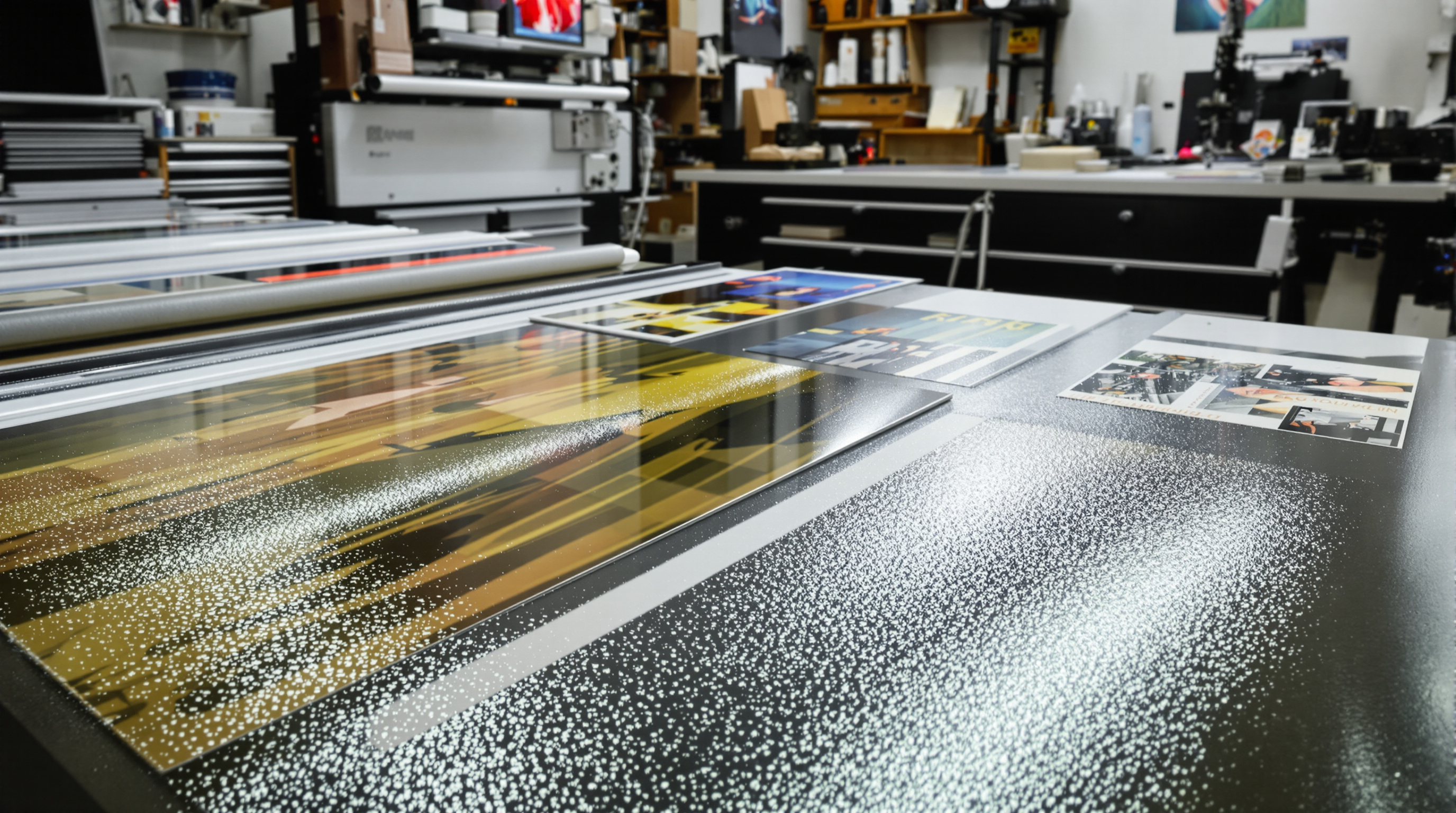
Print isn’t just about putting ink on paper — it’s about creating a full sensory experience. The texture, finish, and weight of your printed materials influence how people see and feel your work. For photographers, artists, and designers in Louisville, understanding these details helps ensure every print tells the right story — not just visually, but emotionally.
Understanding the Foundations of Print Quality
Every great print begins with the paper itself. The paperweight — measured in grams per square meter (gsm) or pounds (lb) — affects both durability and perception. Heavier papers (170–350 gsm) provide a substantial, premium feel, making them ideal for gallery prints, brochures, and fine art reproductions. Most professional photo papers fall between 240–300 gsm, balancing sturdiness with flexibility.
Next comes texture — the tactile character of the paper’s surface, which adds depth and personality to each piece:
- • Smooth: Best for crisp, high-detail photography and clean design layouts
- • Linen: Adds an elegant woven texture ideal for invitations and branding
- • Canvas: Mimics the look and feel of painted artwork
- • Laid: Classic textured lines for a vintage, traditional look
- • Felt: Soft, tactile surface that feels organic and handcrafted
Texture directly influences how light interacts with the paper — glossy surfaces shine brightly, while matte or textured finishes create a subtle, sophisticated diffusion. These choices affect how your audience experiences your print through sight and touch.
For a detailed breakdown of paper types and weights, see Mohawk Paper’s guide on texture and finish.
Matte vs. Glossy Finishes
The finish determines how your printed piece interacts with light and how people perceive its quality. The two main finishes — matte and glossy — each serve different purposes.
Glossy prints create sharp contrast and vibrant color, perfect for marketing materials, product photos, and high-impact visuals. Their reflective surface enhances depth and saturation but can be prone to glare and fingerprints.
Matte prints, on the other hand, diffuse light to reduce glare and provide a smooth, elegant appearance. They are ideal for fine art, portraits, and framed work where subtlety and readability matter most.
Hybrid finishes such as satin or luster offer the best of both worlds — moderate shine with less reflection. These are especially popular for professional photography and high-end print products.
How Texture and Finish Affect Perception
People don’t just see prints — they feel them. Research in design psychology shows that the weight, finish, and texture of printed materials directly influence how viewers perceive a brand’s quality. Heavy, textured papers suggest professionalism and trust, while lightweight glossy stock conveys energy and modern appeal.
- • Glossy: Modern, energetic, and vivid — great for retail and advertising
- • Matte: Artistic, timeless, and subtle — ideal for fine art and luxury branding
- • Textured: Authentic, handcrafted, and tactile — excellent for boutique or creative brands
This sensory communication — known as haptic perception — reinforces emotional response. A well-chosen finish can make a print not just seen, but remembered.
To explore how tactile design impacts brand experience, see Printing.org’s feature on tactile marketing and print.
Craftsmanship Meets Technology
Today’s high-end print production combines artistry with precision. Techniques such as giclée printing use archival pigment inks sprayed in microscopic droplets for exceptional color depth and longevity. The choice of substrate (paper type) matters too — different materials absorb ink differently, altering vibrancy and drying time.
- • Color gamut: Each paper reproduces color differently — choose based on your image tones
- • Ink absorption: Impacts drying, detail, and sharpness
- • Paper white point: Affects warmth and tone of the final image
- • Coating durability: Protects against scratches, light, and moisture
Adding UV-resistant coatings or laminates can extend the life of your prints from decades to over a century, ensuring the color and clarity remain intact for generations.
Local Expertise in Louisville
For artists and photographers in Louisville, professional print studios such as The Print Refinery® – Louisville East provide hands-on expertise in choosing paper, finishes, and display options. Their team helps match each project with the perfect texture and presentation for gallery shows, home décor, or commercial needs.
From smooth luster prints to richly textured fine art papers, local print artisans bring a tactile dimension to photography and design that transforms ordinary projects into premium works of art.
Conclusion
Print texture and finish go beyond technical specs — they’re storytelling tools. Every touch, sheen, and paperweight decision contributes to how a viewer feels about the work. Whether creating fine art prints, promotional materials, or keepsake photo albums, understanding the tactile side of printing turns every piece into an experience that looks as good as it feels.
Discover the perfect print texture and finish for your next project. Visit The Print Refinery® – Louisville East for expert guidance and premium materials.
Explore Print Options